Have you ever thought about retiring in another country, where your money might go further? Well here’s some quantitative data to help you make an informed decision.
First, to get you in the mood, here’s a picture of my friend Erik checking out the prices at a pedal-powered food cart in Thailand. Erik and his wife Joy have done more world traveling than any of my other friends, so they probably have good insight into what it might be like to retire in another country.
I recently ran across some interesting information on Numbeo.com. They had combined data from several different sources to come up with several indices that can be used to compare the prices of various things in different countries: Consumer Price Index, Rent Index, Groceries Index, Restaurant Index, and Local Purchasing Power Index.
I decided to try creating my own maps using SAS.
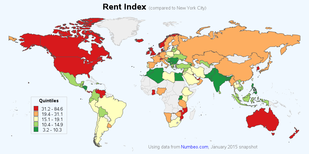
I decided to go with five colors, and assign an equal number of countries to each. This way each color represents 1/5 of the countries (quantile binning). I also used a projection that de-emphasizes the extreme northern areas, and allows the other (more populous) areas to make use of more space. Here’s the Rent Price Index map, for example.
So, after reviewing the data, what country would you like to retire to?What are some other factors to consider, in addition to these indices?
See full story on allanalytics.com
